magazine covers
portraits
Wednesday, November 30, 2016
Monday, November 28, 2016
top 100 photos of all time
a man on the moon
i picked this photo because its a defining moment in history and its just so bizarre to me how it was taken
the picture is of buzz aldrin just standing there being a man on the moon. it doesn't have a lot of the things the other photos have but its still amazing .
the other pictures of the moon landing show the astronaut doing all his tasks
name: neil armstrong
birth year: 1930-2012
schooling:university of southern california
top 100 photos of all time
the hooded man
I picked this photo because i was curious as to what the story was behind it and its a very striking image
this photo was taken by a US soldier who was part of the torture of the iraq prisioners. The picture showed how people weren't being treated like people over there and the the US was in the wrong this time.
i looked at other photos from this place and they were not good. they had people stacked on top of each other and being beaten and dragged on leashes it was very dehumanizing
name : Sergeant ivan franklin
couldn't find any other information
top 100 photos of all time
the face of aids
i picked this image because when i looked at it i could see the pain in this family's faces and it just captured the most horrible moment i could imagine
This picture is of david kirby who died surrounded by his family due to aids. This photo humanized aids in way that had not been done at the time. people saw how aids affected everyone and not solely the victims
i learned that the lady who took the photo really didn't have a plan for the photo she just shot what she saw and that the advertising using it was very controversial
Name: therese frare
birth year: i could not find any information
school attended ohio university
top 100 photos of all time
ellens oscar selfie
I picked this image because it has my favorite person ever in it jennifer lawerence and my favorite jared leto peeking in.
This picture was the most retweeted picture ever and it has all the people in it. Apparently it was also really good samsung marketing.
in the extra little thingy i learned how the photo was started with ellen arms not being long enough and i got to hear bradley coopers voice so good experience
name: bradley cooper
born: 1975
place of birth: Philadelphia
school attended: georgetown university
top 100 photos of all time
alan kurdi
I picked this image because it made me feel sad and I wanted to know the story behind it.
This little boy in the picture was the son of some people who were trying to escape the Syrian war. They were on an inflatable boat trying to make there way to a Grecian island for a better life but a big wave hit and drowned them all this little boy, alan washed up on the shore of costal town called bodrum. This picture shined a light on what the people in these overlooked countries went through for better life
doesn't have one
name: nilufer demir
born:1986
place of birth: turkey
school attended: worked with the dogan news agency since she was a teenager
Friday, November 18, 2016
Wednesday, November 16, 2016
fashion photography
video 1- changes to models face
- eyes bigger
- eyes lowered
- thinner neck
- lips bigger
- neck longer
- face thinner
video 2- changes to models body
- made legs longer
- arms longer
- made her less tanned
- longer neck
- flatter stomach
- made her thighs skinnier
- made here eyes bigger
- made her nose more symmetrical
- her shoulders higher
video 3- changes to models body
- made her boobs bigger
- made her waist smaller
- made her have more hair
- made her arms and legs thinner
- got rid of cellulite
- made her head larger
no i don't think so its ethical to do this to this extent. Especially because there is young girls looking at these things and thinking that is real. I think photoshop is fine and using it in small doses is helpful, but completely changing the way someone looks leaves me to question why the original persons figure wasn't good enough
I think there should be some type of notice saying that the photo was altered very heavily, because if you show these to people they'll think real people look like this and not feel great about their own bodies
I think slightly altering anything is fine, like slightly changing someones nose or making their eyes a little bigger or getting rid of some wrinkles. I draw the line when you are completely changing someones appearance so that they don't look like them at all
i think fashion photography is more about getting people to buy a product and photo journalism is about telling a story with pictures or capturing significant events
fashion photography i feel is very far from reality, though its been getting better the magazines still only highlight one "ideal" body type and if you don't have that you're screwed. I feel like photo journalism shows whats actually real and that is more ethical than what the fashion industry does
to show us that not everything is what it seems to be and teach us to use photoshop in a way that won't be harmful
although guys get photoshopped too it is not to near the extent that women are.
Monday, November 14, 2016
5 websites
spiral staircases
http://petapixel.com/2014/12/19/disorienting-beauty-spiral-staircases-old-abandoned-buildings/
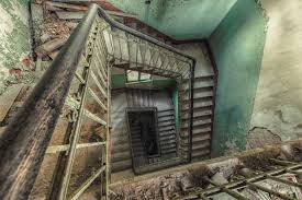
On this website i looked at pictures of several different spiral staircases which was quite disorienting. They were shot by a german man named Christian Richter who saw the beauty in the abandoned staircases in the abandoned buildings.
I learned that a good abandoned staircase is hard to find Richter sometimes searches for days to find the perfect one, thats dedication to the art.
oldest living things in the world
http://www.rachelsussman.com/oltw/
On this website I looked at pictures of the oldest things that are still living in the world. I saw pictures of trees, micro organisms, mountains, sea creatures, and other various ancient things. The pictures included descriptions of the photo and how old it was.
I learned that things in nature can live for really really long amounts of times and still look virtually brand new.
http://petapixel.com/2014/12/19/disorienting-beauty-spiral-staircases-old-abandoned-buildings/
On this website i looked at pictures of several different spiral staircases which was quite disorienting. They were shot by a german man named Christian Richter who saw the beauty in the abandoned staircases in the abandoned buildings.
I learned that a good abandoned staircase is hard to find Richter sometimes searches for days to find the perfect one, thats dedication to the art.
- On this website I saw pictures of many abandoned staircases shot by photographer Christian Richter. The pictures were stunning because you would look at some of them and not even know it was a staircase, some looked like abstract paintings.
- I learned that photography is all subjective, the thing you're shooting doesn't necessarily have to look how it does in the real world. Also everyone looks at things differently what looks like a staircase to someone else can be something completely different to me.
- The site relates to photography because they are photos designed to show people something beautiful inside something that is run down and no one sees as something worth time.
oldest living things in the world
http://www.rachelsussman.com/oltw/
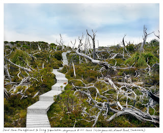
On this website I looked at pictures of the oldest things that are still living in the world. I saw pictures of trees, micro organisms, mountains, sea creatures, and other various ancient things. The pictures included descriptions of the photo and how old it was.
I learned that things in nature can live for really really long amounts of times and still look virtually brand new.
- I picked this photo because I think its really beautiful and has a lot of character. It also has a sense mystery to it, like where does that staircase lead to? I don't know, but I want to
- Rules of photography included in this picture are lines, shown by the staircase, simplicity, shown by the simple blue sky in the background, and balance, shown by the the trees in both the foreground and middle ground to balance each other out.
- These pictures were taken by Rachel Sussman.
killer timelapse
http://blog.ted.com/how-to-create-a-killer-timelapse-with-joe-capra/
On this website I looked at a time lapsed video of Rio and places around there. I saw how the world changes in a matter of seconds.
I learned about the many things you need to accomplish to make a good time lapse and the way timelaspes are used in media.
- In the video I saw how places around Rio change over time, I saw the things that you wouldn't see if you just sat staring for an hour.
- The person who made the video was Joe Capra, he used to do mainstream photography until he saw a time lapse and became obsessed. Now he travels around shooting time lapses for big companies.
- Basically, Joe was starting to get recognition for his time lapses and was commissioned by Panasonic to shoot them for their tvs, he got to choose a place to go and shot what he wanted. When he was editing he took notes from his friends and family then came out with the finished product.
- A new thing that I learned is you can use time lapse to show change over the course of years. I did not know you could do that i thought the longest was a day or two.
DIY photo stands
http://content.photojojo.com/diy/diy-photo-stands-how-to-train-your-dinos/
On this websites I looked at a tutorial on how to make dinosaur photo holders. they went through step by step to teach people a fun way to display photos.
I learned how i can display pictures without having to buy a frame and hang it on the wall which will save space on my walls for other things.
- I learned how to make dinosaur photo holders by cutting them in halves and gluing magnets to them to keep the photos up right.
- I can use this in your class by having a cute way to display the pictures that I take.
- This tutorial did not help me learn a program because it had nothing to do with computers
how to make cinema graphs
http://content.photojojo.com/tutorials/how-to-make-cinemagraphs-photos-that-move/
On this website I looked at how to make a cinema graph. A cinema graph is a picture that moves, it is not a video just a moving picture.
I learned what gif stands for Graphics Interchangable Format, still am unaware of which way is the proper way to pronounce it.
- Today I learned how to make a cinema graph.
- I can use this in your class by making a cinema graph if it would help enhance the photo.
- This tutorial taught a way to use adobe photoshop by editing a video to make it look like one moment in time.
* the link to the last part would not let me through but i would probably not want to do a challenge because i don't have a camera or anything to edit with
Monday, November 7, 2016
magazines part 2
- The first magazine cover type is imaged based this is the most common and showcases what the magazine is about centered around one beautiful image. Second is illustration based this is used when the magazine wants to convey something funny or out of the ordinary most magazines don't use this though. And a third option is type based which has lettering that gets across the message the publication wants, lastly there is concept based design this is a mixture of the other three and uses strong imagery to convey a strong message. All of these things can work but you have to make sure that the message is received fast and well.
- the relationship between the words and the pictures on the magazine cover is the words are supposed to help explain why that picture is there and why that picture makes sense for the cover because it relates to the rest of the magazine
my favorite cover
favorite ^
"For W’s December/January Art Issue, the magazine collaborated with artist Yayoi Kusama to create this iconic cover image depicting George Clooney. The visually arresting image is the highlight of the cover story, for which five leading female artists were invited to create interpretive portraits of the actor. Clooney wears a suit painted by Kusama with her signature polka dots and stands against a polka-dotted backdrop. Planned to coincide with the opening of an exhibition of new work by Kusama at David Zwirner Gallery, the cover makes a powerful reference to the artist’s iconic self-portraits."
I really enjoy this portrait because first of all it has George Clooney who is arguably one of the most attractive human beings to ever walk the earth and second of all its different. They are trying to show an art within the photographed i think this photo shows very high end art fantasy. I like how you can still see the outline of his suit but he is also camouflaged I think thats really cool. The only thing i wish was different is the letters i wish they were bolder so i didn't have to look at it for a while to see what they say. Other than that one minor thing I think this is a very well put together photograph.
best magazine covers 2013
- formal
- casual
- environmental
- environmental
- formal
- casual
- formal
- formal
- formal
- formal
- casual
- formal
- environmental
- formal
- casual
- environmental
- casual
magazine tips
- think of how to make the picture appealing
- try and make it simple but not too simple
- make the cover look like its worth something to the consumer
- think of ways to arouse curiosity in the magazine cover
- think about how to make it look like something you would be proud to show as yours
Friday, November 4, 2016
self portrait and portraits part 1
. Experiment with Lighting
Another element of randomness that you can introduce to your portraits is the way that you light them. There are almost unlimited possibilities when it comes to using light in portraits.
Side-lighting can create mood, backlighting and silhouetting your subject to hide their features can be powerful.
Introduce Movement
Portraits can be so static – but what if you added some movement into them? This can be achieved in a few ways:
- by making your subject move
- by keeping your subject still but having an element in the scene around them move
- by moving your camera (or it’s lens to achieve a zoom burst)
The key with the above three methods is to use a slow enough shutter speed to capture the movement.
The alternative is to have your subject obviously move fast but to use a shutter speed so fast that it ‘freezes’ their movement.
Engaging Your Subject
The first order of business is to engage your subject. This is where we all have to learn to overcome our shyness and approach people in an open and friendly manner. Be up front about who you are and what you're doing. Don't just barge into a scene with your cameras blazing. In fact, it is usually best to leave your camera in its bag when you first approach people, so as not to frighten them. Take time to engage the person in conversation, just as you would if you didn't have a camera. Remember the Golden Rule. Think about how you'd feel if someone approached you and wanted to make a photograph. How they did it would determine how you would respond.
environmental portraits
i liked this photo because the kid looks so happy and i picked it because he looks like he's found his little place to be
i liked the photo because i just love old people they make me happy and i picked it because of that reason
self portraits
i liked the picture because it shows 2 sides and you can tell she's a little sad, i picked it because its just a really cool image
i liked this picture because i thought it was cute and it made me laugh, i picked it because it was different than the there ones
casual portraits
i liked this picture because the man looks like he's having a grand old time, i picked it because the man was ding something different than just standing there
i liked this photo because both the people seem really happy and i picked it because she wasn't just doing nothing she was playing with her kid
For my self portrait i was thinking about shooting it in my room with me sitting on my bed and i don't know how i would do this just yet, but i have these pictures of all my friends on my bed frame and i would want to show them somehow because they are my home. i guess to make the shot successful i would have to try different angles and play with the camera settings. And for my portrait of another person i was thinking i could shoot my friend Collin because he's really really tall and he's an interesting enough guy so i think i can get some fun pictures. i think i can make it successful by finding some good lighting and really playing around with that.
Wednesday, November 2, 2016
american soldier
- I think the most powerful image of all was the one where he and his are at the dinner table and Ian is crying, because you can really see that he is having a rough time and you really feel sorry for the guy.
- These images show the major points in his enlistment and really conveyed what was going through his mind, they tell his story very well in my opinion.
- The captions enhance the photography by being there to explain the things that we cannot see through the photograph like events that would happen later and what exactly is happening in the picture.
- When Ian Fisher was 17 he decided that he would join the army. Through basic training he began to question if the early mornings and back breaking works what he wanted to do with his life, but ultimately decided to go through with it because he wanted to serve his country. When basic training was over he was sent to California which wasn't very far from his home so most weekends he came back to visit. He developed a drug problem from the stress, he and his fiancee split, and he felt he didn't belong anywhere, because he was late coming back from weekends he was punished and he finally told the army of his addiction. By telling he risked being discharged but he was only dropped a rank. After a year it was finally time for him to got Iraq he spent time there and came back for break to see his new girlfriend and family then went back over seas. He served his country for a year over there and was very proud of it. when he returned he married his girlfriend Devin.
- present tense
- break down captions-
3 or 4 sentences
information about what is happening in the photo
second sentences provide who is with him and some background information
third sentences show more background info
yes they do
yes some captions have 4 sentences
7. because some photos can explain more than words can and you can really see what they are experiencing
8. you bother writing stories people like to read them and not all stories are true events so you could really depict fiction if all stories were just photos and captions
Subscribe to:
Posts (Atom)